
Recce’s, monsters and colour choices
TECH RECCE’S
These involve checking out the location with a DOP and gaffer in order to decide on a lighting plan, we did this at Victoria baths which was now our only shooting location along with Vinnie, one of our gaffers to plan what we would attack the shoot with, the plan was for minimal sources and to give hints of lighting specifically within the basement stairs section, the bathroom would be more of a vibe we were going for in the bedroom, a bubble or light and heavily darkened corners of the room to add a bleakness to Mason’s existence.
DO YOU TAKE CHANGE?
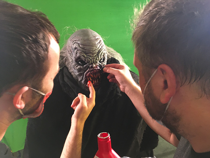
I’ve always been rather pigheaded and controlling in my decisions but had to learn to overcome this when dealing with other creatives. As I had lived with the project for so many years and had such a strong mental image of my monster, any deviation from that design disturbed me a little.
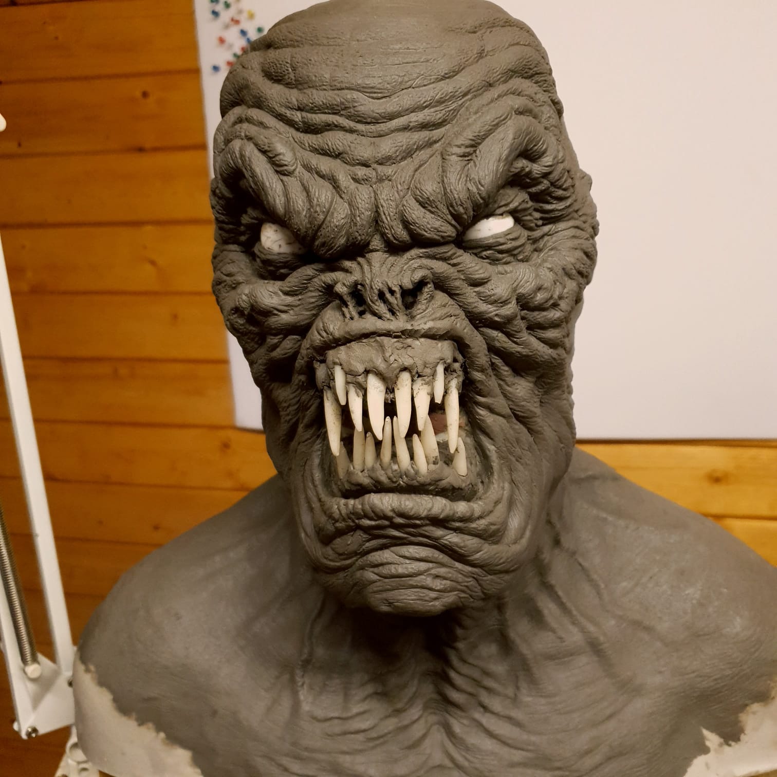
When Demitris first did the teeth arrangement they were a uniform almost fence like look which didn’t seem right and neither of us dug it.
He did another version with a more Nosferatu Salem’s Lot arrangement (Two large fangs where the incisors would be) I told Demitris it was cool but I was trying to get away from that classic look for a vampire I had also told him in the design phase no bat-like features which always struck me as a cliche. Demitris came back with the new tooth arrangement and I liked it but it wasn’t what I came up with.
I spent the evening chatting with him and Demitris reminding me every thing is subject to change. I as micro managing everything into an absolute and had to let him expand on what I had come up with as he was at the end of a the day a professional and should rely on that opinion….
Three days later I loved the new teeth design…
We also decided on a color look that evening. One that was a cross between one the David Naughton Opera ghoul from An American Werewolf in London and the color scheme on another premade up mask from a separate company. This was varying away from the blue ‘Barlow’ look from Salem’s Lot but we both decided it would be striking if he has a slightly blue tinged but pale look, that combined with the lighting design would create for a startling final image.
COLOUR BLIND
We created a color test for the panels of the set at Martin’s workshop one set flat was available and we painted it into quarters: Light and dark, green and blue, a friend Rick McNally stood in a rough approximation of the costume and we checked out lighting and gels, tungsten was the way to go and although it played well with our model it didn’t with the painted set flats…, green became brown became red became mustard and the other colors acted badly as well
We visited Liverpool Scenic to check out the current state of the build and also chat with the scenic painters, we came to the decision a neutral off white would be the best bet as the colors wouldn’t alter under different lighting and would give us the most control in the grade after the shoot was completed.
We also added some embossed framing to the walls of the set and a picture rail to the bedroom to help break up the dead space of the walls.
WATERWORLD 2
The budget was getting somewhat crazy, it had in creased from 25K to 30K to 35K and was two weeks before principal looking at 40K of final costings (make that 50K)). The main issue was I underestimated the Production designers costs and certain people coming onboard had costs that had to be met.
I knew I would be able to reclaim 25% from the UK tax rebate but spending a third of a mortgage on a short film was a freaky idea when you stepped back and looked at it all.
MAKEUP A NEW HOPE…
After asking everyone I knew for a good makeup person recommendation, Martin Butterworth Suggested Melanie Doyle who ran her own Makeup academy and was thrilled at the notion of working on a high end short film. Melanie offered to create some silicone appliances for the injuries as well as bringing her own assistant
JUST FIVE FRAMES….
The one thing that I was never fully satisfied with when we shot the hallway scene at
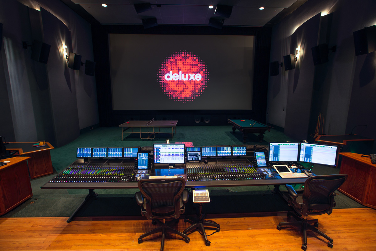
Grade and Sound
We had spoken to Deluxe who had asked us to mail over any source images for the